Take-home Exercise 3: Be Weatherwise or Otherwise
Overview
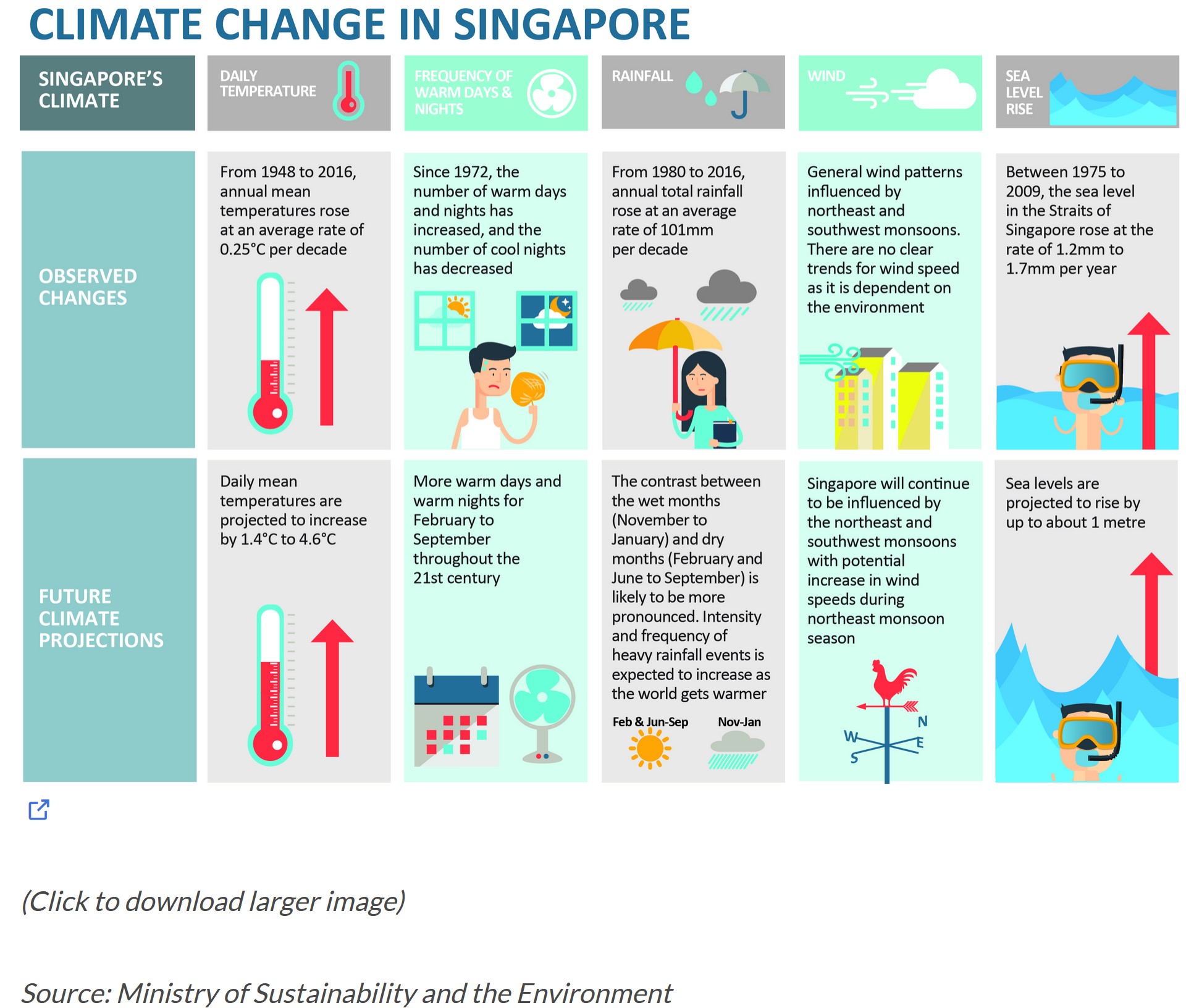
According to an office report as shown in the infographic below,
- Daily mean temperature are projected to increase by 1.4 to 4.6, and
- The contrast between the wet months (November to January) and dry month (February and June to September) is likely to be more pronounced.
As a visual analytics greenhorn, you are keen to apply newly acquired visual interactivity and visualising uncertainty methods to validate the claims presented above.
The Task
In this take-home exercise, you are required to:
- Select a weather station and download historical daily temperature or rainfall data from Meteorological Service Singapore website,
- Select either daily temperature or rainfall records of a month of the year 1983, 1993, 2003, 2013 and 2023 and create an analytics-driven data visualisation,
- Apply appropriate interactive techniques to enhance the user experience in data discovery and/or visual story-telling.
Submission Instructions
This is an individual assignment. You are required to work on the take-home exercises and prepare submission individually.
The specific submission instructions are as follows:
- The analytical visualisation must be prepared by using R and appropriate R packages. The report must provide detail discussion and explanation of:
- the data preparation process,
- the selection of data visualisation techniques used,
- and the data visualisation design and interactivity principles and best practices implemented.
- The write-up of the take-home exercise must be in Quarto html document format and publish on Netlify.
Submission date
Your completed take-home exercise is due on 18th February 2024, by 11:59pm evening.
Peer Learning
- ALEXEI JASON
- CAI JINGHENG
- CHAI ZHIXUAN
- CHEN HAOYE ROGER
- CHEN JINGHAN
- CHOCK WAN KEE
- CHOW HUI LING
- CHRISSANDRO
- CI HUI
- COLIN JIANG KELIN
- DU YEBIN
- FREDDIE JR. NGO TAN
- FU WEIMING
- GAO YA
- GOH SI HUI
- IMRAN BIN MOHD IBRAHIM
- KANYAPAK BUATHANG
- KOCK SI MIN
- KYLIE TAN JING YI
 Have done exceptionally well to ensure that the processes are reproducible. Able to design elegant and yet functional data visualisation. Able to apply interactivity effectively.
 - LEE YUEH ERN SHANNON
- LEW YING ZHEN SERENA Have done exceptionally well to ensure that the processes are reproducible. Putting the methods of visualising uncertainty and ggstatsplot into good used.Able to apply the functional data visualisation. Able to apply interactivity appropriately.
- LI JIAYI
- LI ZHONGCHAO
- LIM JIA JIA
- MARY VANESSA HENG HUI KHIM
- MICHAEL BERLIAN
- MOHAMED FIRDAUS BIN MOHD GHAZALI
- MUHAMMAD RIZQI FEBRIANSYAH
- NEO LI XIAN VICTORIA ANNE
- NOEL NG SER YING
- RACHEL YEE RUI MIN
- SHAO GUYUE
- SUN YIPING
- TAAM YIN KWAN EUNICE
- TEO SUAN ERN
- TOA ZI YING JANET
- WAN HONGLU
- WANG YALING
- WANG YIZAO
- WEI YANRUI
- WONG NGAI MUNN ZACHARY MARK
- XU LIN
- ZHANG SHUJIE
- ZHAO XINYUE
- ZHENG KAIXIN
- ZHOU RUOSONG